What distinguishes a 3D logo from a 2D logo?
The representation of a company’s identity and ideals through a logo is essential in the realm of design and branding. They act as visual icons that convey a brand’s identity and let consumers to recognise it right away. Two of the most popular sorts of logos are 2D and 3D logos, however they can be made in a variety of shapes and sizes. We will examine the main distinctions between these two logo types in this blog post, as well as their distinctive qualities and the effects they have on consumer perception of the brands.
Definition and Visual Appeal
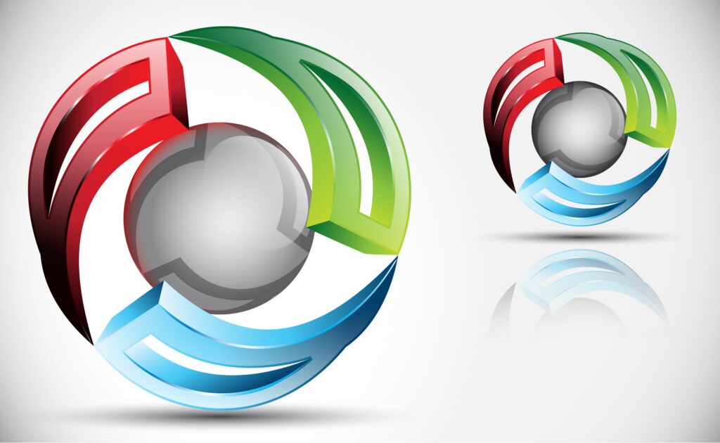
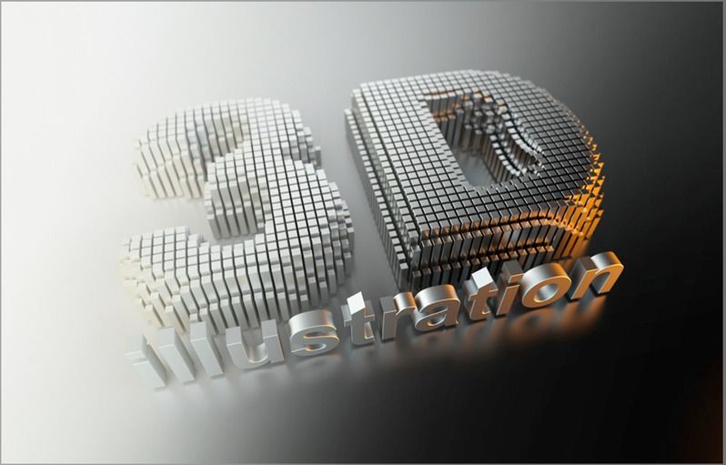
A 3D logo is made to give the impression of being three-dimensional, frequently looking to have depth and dimension. These logos are created with the aid of sophisticated software that gives them depth, shadows, and other realistic components, making them eye-catching and captivating. While a 3D logo has depth and dimension, a 2D logo is flat and lacks those qualities. Its simplicity in appearance and effectiveness in communicating a brand’s message are both a result of its use of simple forms, lines, and colors.


Realism vs. Simplicity
The degree of realism that 3D and 2D logos depict is one of the key differences between them. With the help of lighting effects, shading, and textures, 3D logos provide the impression of depth and solidity. They are appropriate for businesses looking to present a contemporary, cutting-edge image because they frequently mirror real-world products. Contrarily, 2D logos value simplicity and emphasize sharp edges, vibrant hues, and memorable imagery. They are better suitable for brands that value simplicity and minimalism since they are more ageless and adaptable.
Application and Versatility
It’s crucial to consider how the logo will be used across various platforms. Digital platforms, marketing, and multimedia presentations can all benefit aesthetically from 3D logos’ complex intricacies and lifelike effects. But because they are complicated, they could be difficult to print or scale down to smaller proportions. On the other hand, 2D logos can be easily customized and scaled for use in a variety of applications. They can be accurately replicated and kept visually intact in a variety of sizes and media, including print materials and goods.


Brand Identity and Perception
Logos have a big impact on how people perceive a brand. A 3D logo typically evokes a sense of modernism, progress, and invention. Brands in fields like gaming, architecture, or technology may find it particularly effective. A 3D logo’s visual richness and depth frequently convey refinement and professionalism. A 2D logo, on the other hand, places emphasis on simplicity, elegance, and timeless design. It may arouse feelings of heirloom, sincerity, and approachability. Many firms looking for a timeless, unobtrusive appearance select 2D logos.
Conclusion
Both 3D and 2D logos have the same function of visually portraying a business, yet they use quite different techniques and achieve very different results. The identity of the brand, the target market, and the design goals ultimately determine whether a 3D or 2D logo should be used. 3D logos have an eye-catching, contemporary appeal that is ideal for firms looking to project innovation and elegance. Contrarily, 2D logos value simplicity and adaptability and offer a timeless and flexible depiction. Making informed design selections that are consistent with a brand’s mission and values requires an understanding of the differences between various logo types.


